Mogul 
Senior Product Designer
Mogul Recruiter Tool
Mogul
Senior Product Designer
Mogul Recruiter Tool
Led end-to-end product redesign
Conducted user interviews and testing
Audited and mapped user flows
Defined new job-centric experience
Partnered with engineers for launch
Cut time to hire in half
Increased product engagement by 40%
Improved customer retention by 30%
Simplified navigation and workflows
Boosted recruiter confidence and satisfaction
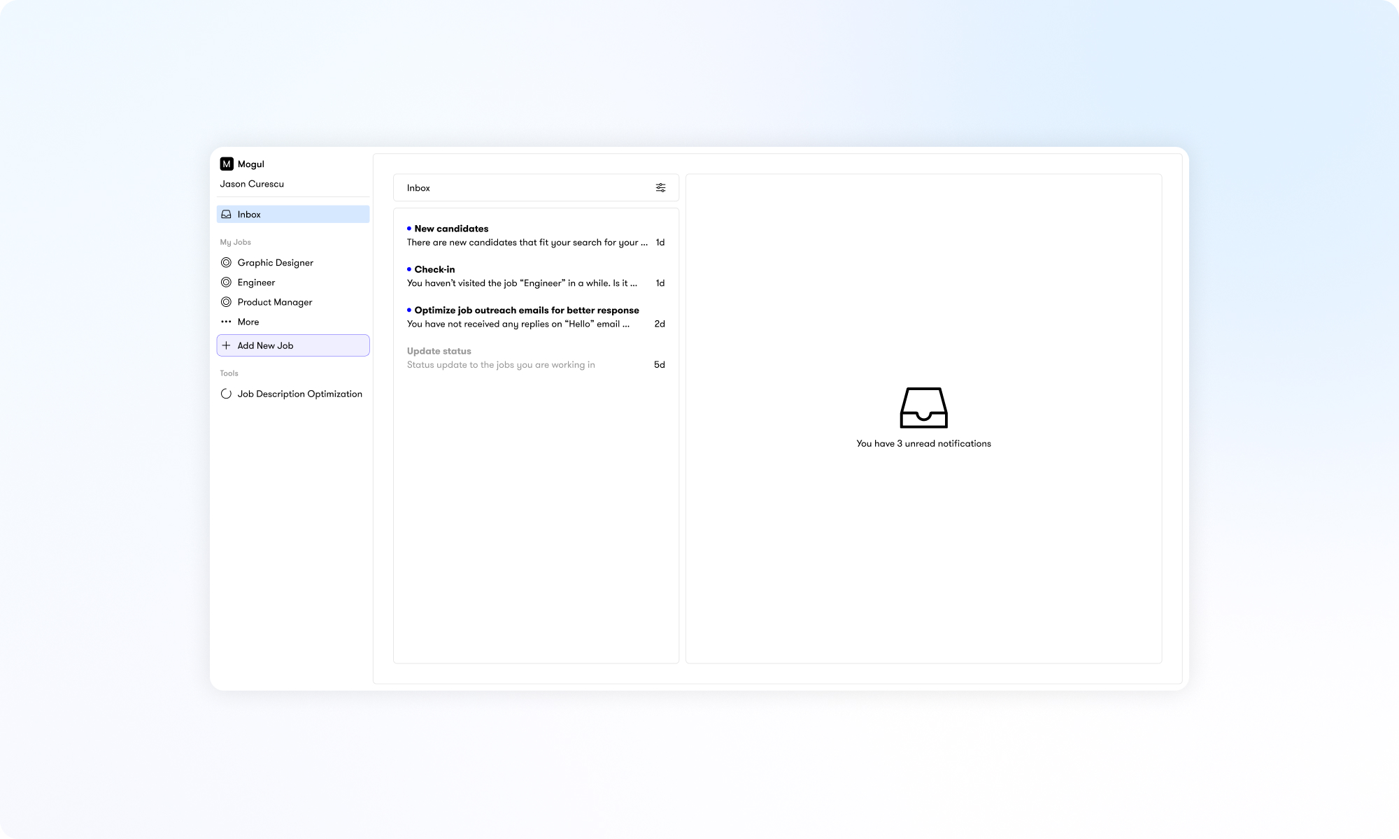
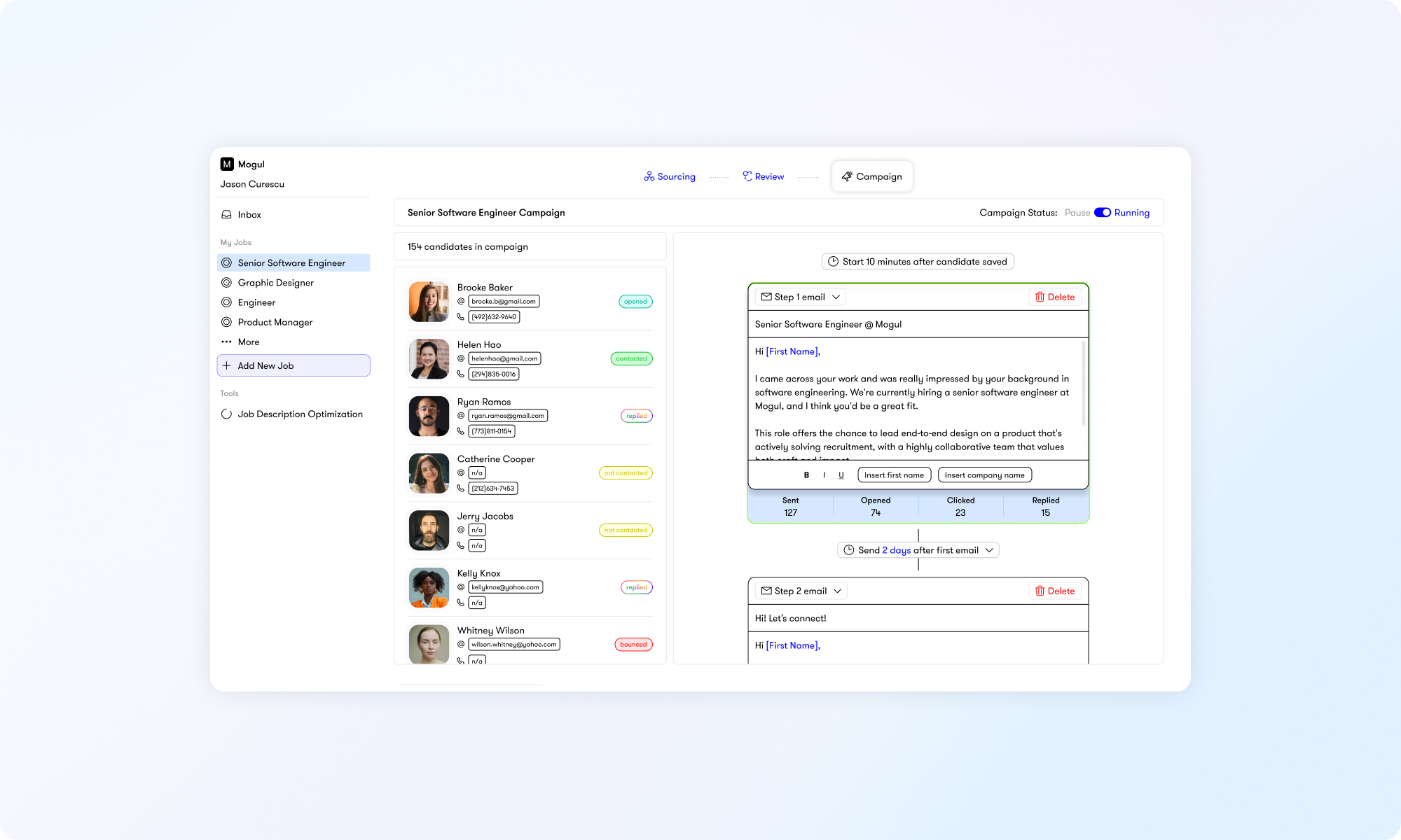
With new features like job description-to-keywords matching, AI resume ranking, and a built-in CRM, the Mogul Recruiter product had started to feel cluttered and harder to navigate. Recruiters weren't sure where to start their search or how to move efficiently from sourcing to outreach.
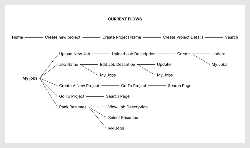
I talked with our executive recruitment team, the Client Success team, and both high and low-usage clients to understand where people were getting stuck. Recruiters were often confused by the navigation and unsure where to start a search. The process of sourcing, reviewing, and reaching out to candidates didn't have a clear flow, which left users unsure what to do next. I mapped out user journeys to spot these gaps and figure out where friction was happening.
Two potential paths emerged
1. Redesign the navigation to make key actions clearer and reduce unnecessary steps.
2. Completely rethink the experience to address deeper usability issues.
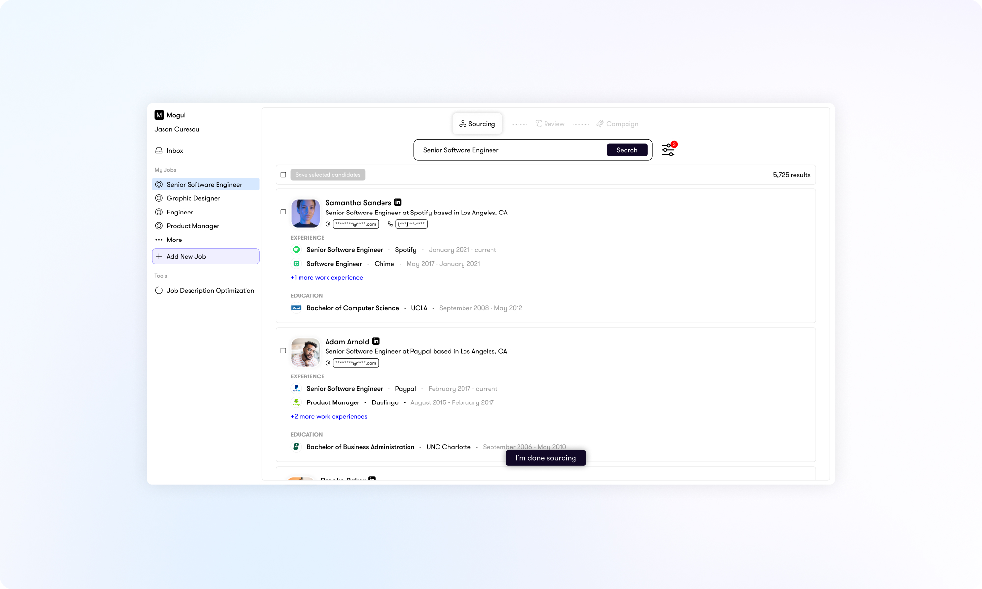
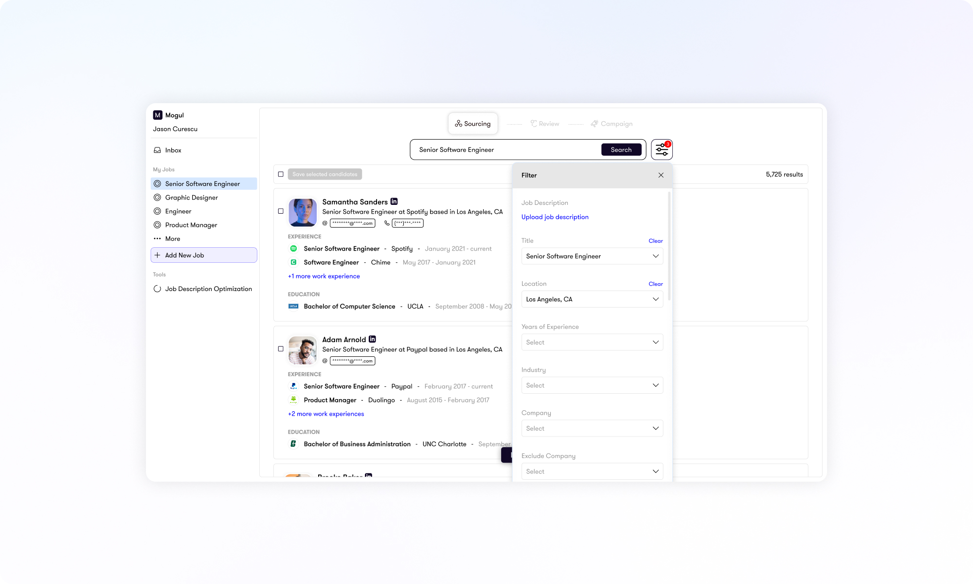
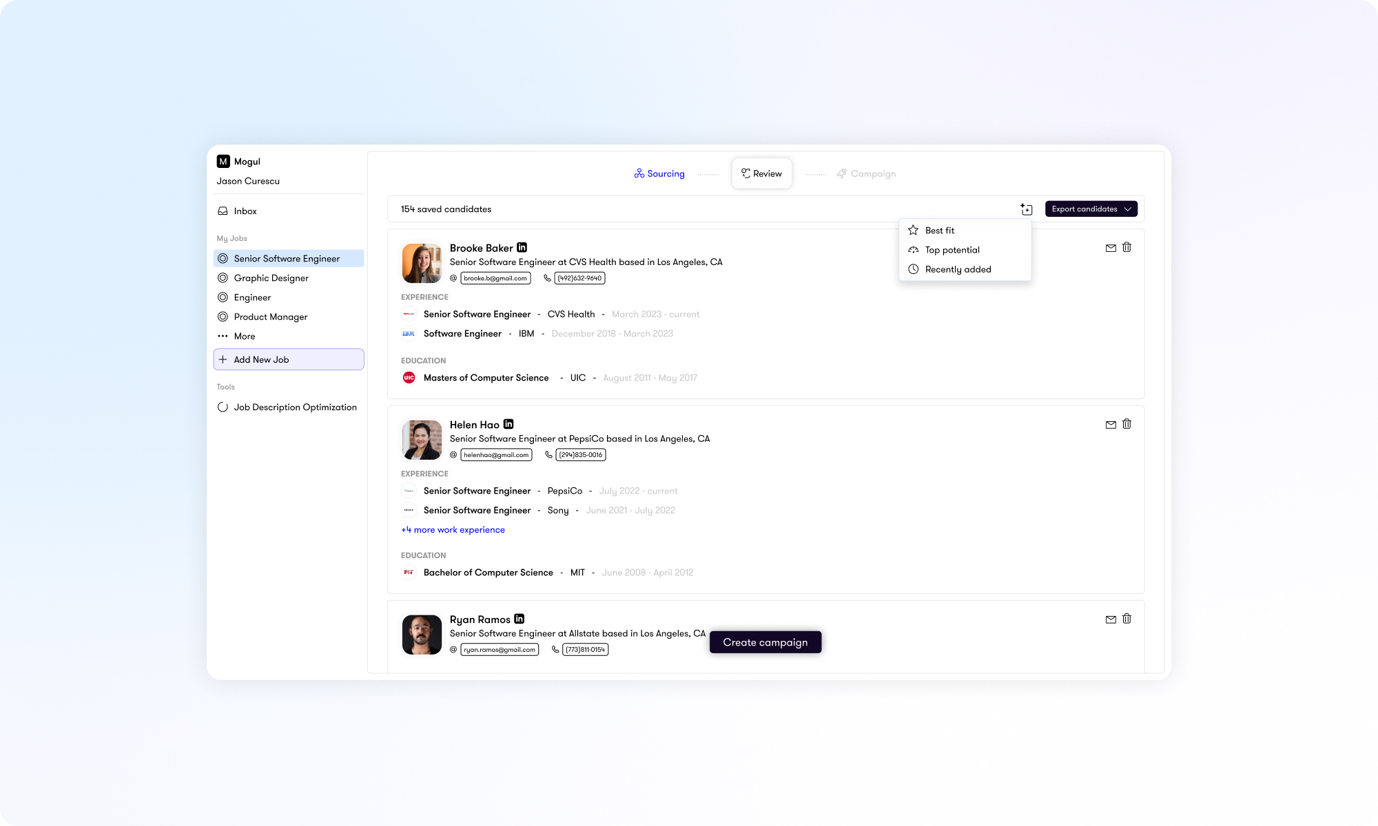
I chose a full redesign, understanding it would take more time but believing it was the right long-term investment to make the product scalable and future-ready. The new experience was restructured around a job-centric model, where all related actions (sourcing, candidate review, campaigns, and progress tracking) live in one place. This gave recruiters a single, focused workspace instead of a scattered experience. I also simplified the navigation, clarified the flow, and reduced visual clutter to make it easier to move from one stage to the next.